

Scaling design system
for multi-platform experiences
Led the design system creation process for T-Mobile apps
Year
2020
Client
Role
DS designer
Overview
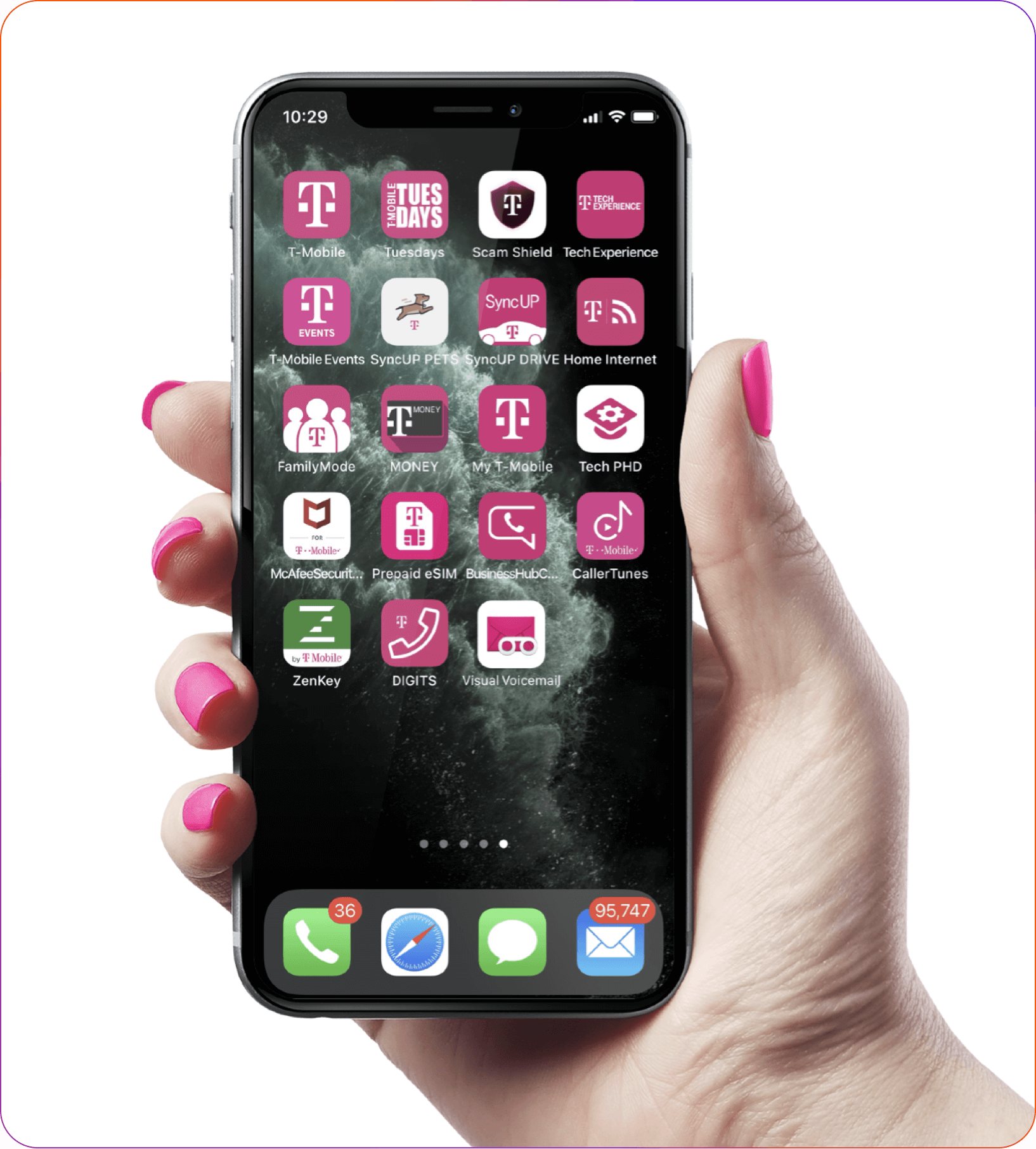
T-Mobile has over 50 apps available to customers in the app stores. The app ecosystem was disconnected, unregulated, and oversaturated, leading to a poor user experience.
- Not using native app components and experiences resulted in customer dissatisfaction and poor accessibility.
- Inconsistent brand messaging undermined the vision and value perception by customers.
Goal
Our goal was to create a holistic approach to the app portfolio and establish governance and rationalization for existing applications.
We aimed to ensure consistency in app UX and UI, following best practices in mobile application design.
Approach
The first step was to create a set of patterns, guidelines, and best practices.
When I joined the company, we had a design system with T-Mobile web patterns. The goal was to extend this existing design system to include native apps.
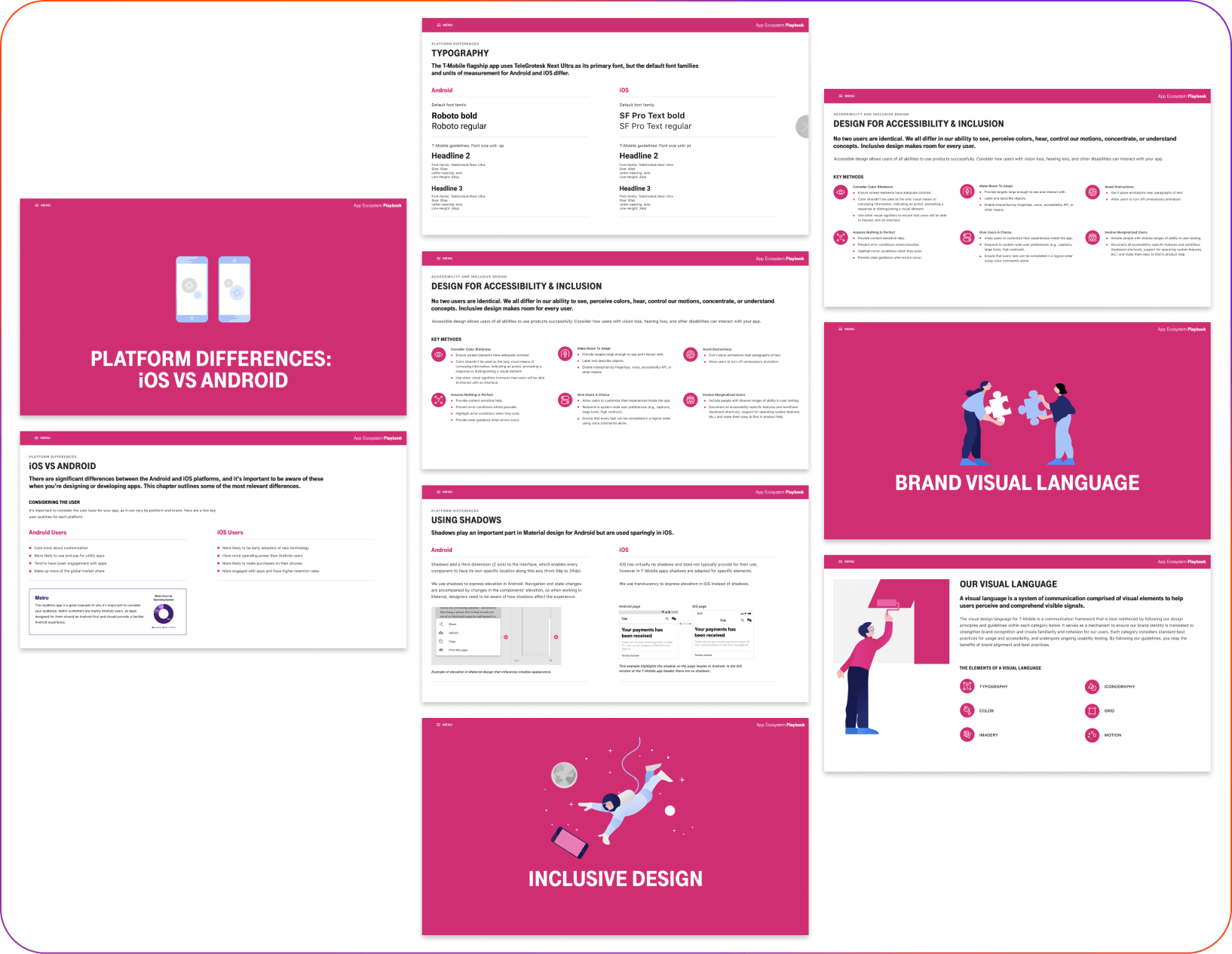
Create an App Playbook:
- An extensive UI resource for internal and external cross-functional teams to create, update, and reference mobile applications, promoting harmony across our T-Mobile app portfolio.
Create a UI Kit for the Main T-Mobile App
- A tool that makes creating the main T-Mobile app fast and easy by providing pre-made, reusable components.
App Playbook
I was responsible for building the visual design, best practices in UX, and accessibility sections of the App Playbook.
Since T-Mobile's portfolio includes a variety of different apps, I started by analyzing which elements should be consistent across all T-Mobile apps and what would differentiate those apps from each other.
The sections included typography principles, color schemes, platform difference guidance, accessibility instructions for apps, and guidance on shadows and motion.
The sections included typography principles, color schemes, platform difference guidance, accessibility instructions for apps, and guidance on shadows and motion.
App UI Kit
The T-Mobile app is a hybrid app, meaning that some screens are native while others are web-wrapped.
A UI kit library was built in Adobe XD. Since the company used Adobe Creative Cloud tools, creating a components library in Adobe XD allowed stakeholders to easily use components across all Adobe CC tools.
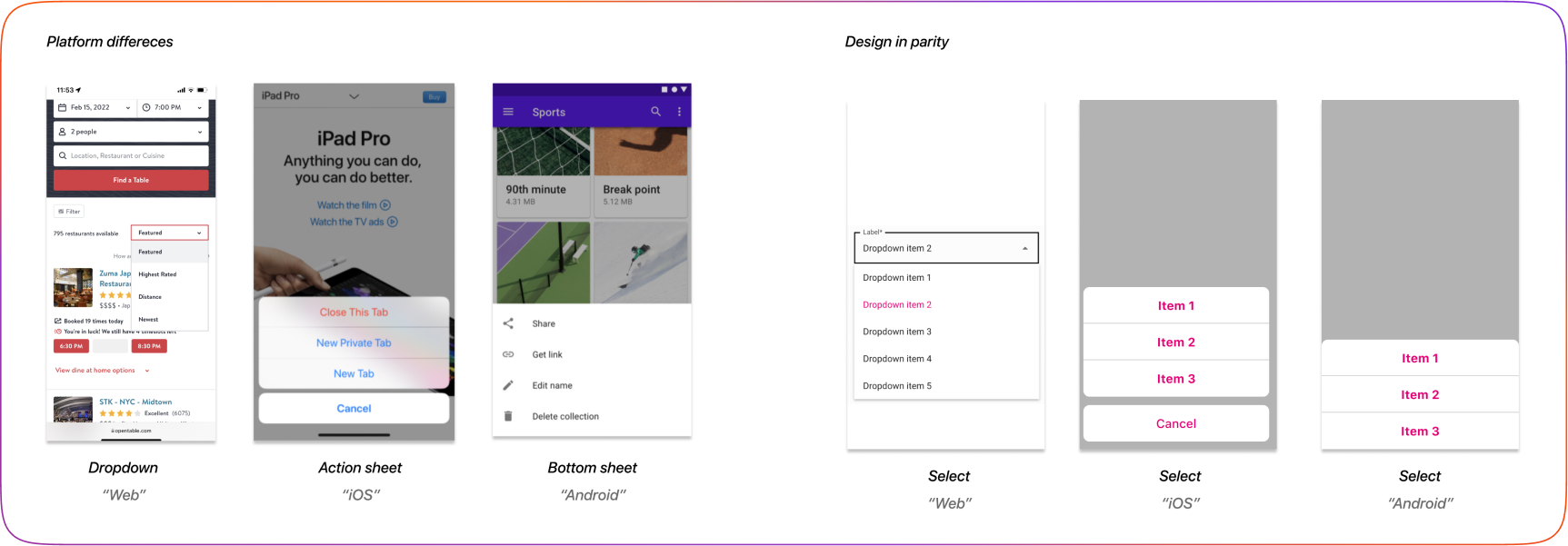
Step 1: Platform differences challenge
The challenge at this step was to create components that adhered closely to the native patterns of the OS (iOS and Android) while maintaining visual and user experience consistency with the web-wrapped pages.
By closely following the Material Design guidelines and Apple's Human Interface Guidelines, a list of all main components was created. Components were then prioritized, determining which should be native and which should stay consistent with the web pattern.
By closely following the Material Design guidelines and Apple's Human Interface Guidelines, a list of all main components was created. Components were then prioritized, determining which should be native and which should stay consistent with the web pattern.
The goal was to create one design system that could be used across all platforms, making building the system in parity a crucial part of the process.
Step 2: Building in Parity
See my approach to creating a single library.
After making decisions on the components and pattern differences, collaborating with designers responsible for web patterns I began to align the naming of the components.
For the most part, component parity naming was straightforward because many components, like buttons, cards, and carousels, are system-agnostic. However, some components needed to visibly replicate their platform to match expected behaviors, making the process more challenging.
For example, on the web, we use a "dropdown"; on iOS, it’s an "action sheet"; and on Android, it’s a "bottom sheet." All these components represent the same feature.
I intentionally skipped Patterns, as it is more helpful to show patterns within the whole page for mobile app screens.
Step 3: Building Responsive Components and Documentation
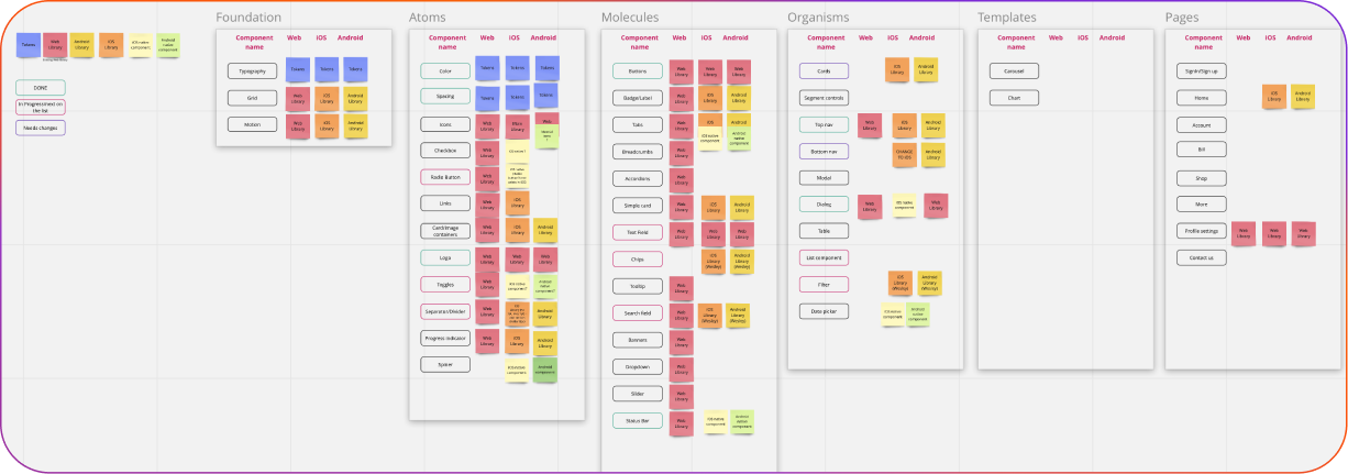
I structured and built components following an atomic-level structure: Atoms, Molecules, Organisms, and Pages.
The main XD file also serves as documentation. The right section of every artboard is dedicated to iOS, while the left section contains usage documentation for Android.
Every component is responsive and available in different states, allowing designers to easily switch between states using the XD right tools panel.
Working with Developers
Our team followed a waterfall project structure. The accessibility coach worked closely with the design team, but including developers early in the process was challenging.
Working with developers after all components were built in Adobe XD slowed down the process, as some components needed to be adjusted based on their feedback.
However, having the token system of the foundational elements helped us while working with the developers, making collaboration much easier.
See my case study “Design Tokens”
However, having the token system of the foundational elements helped us while working with the developers, making collaboration much easier.
See my case study “Design Tokens”
DS Adoption
At that time, Adobe XD was a new tool for our company, and designers were not familiar with the library features.
To address this, the design system team hosted a series of workshops with other UX design teams to ensure they understood the tool and, most importantly, used the UI kit components correctly.
One of the governance challenges we faced was that designers who had historically designed for the web were now being assigned to new app projects. We needed to ensure their work reflected the UX principles specific to app design.
To help designers understand platform differences, I added detailed documentation on the behavior of native components.
Additionally, DS team ran weekly office hours (with app developers and the accessibility coach included) to guide designers on platform-specific components and their usage.
Results
Integrated Experience:
- Creating a consistent, cohesive UI look and feel reduced consumer frustration by standardizing processes, brand usage, tools, collaboration efforts, and overall alignment.
Increased Satisfaction:
- Providing good experiences means consumers are more willing to consider additional purchases.