Sprint-T-Mobile Merger
Developed a new experience and visual language for Sprint customers transitioning to T-Mobile
Project Timeline
3 months
Client
Role
Product designer
Overview
Sprint joined T-Mobile in 2020.
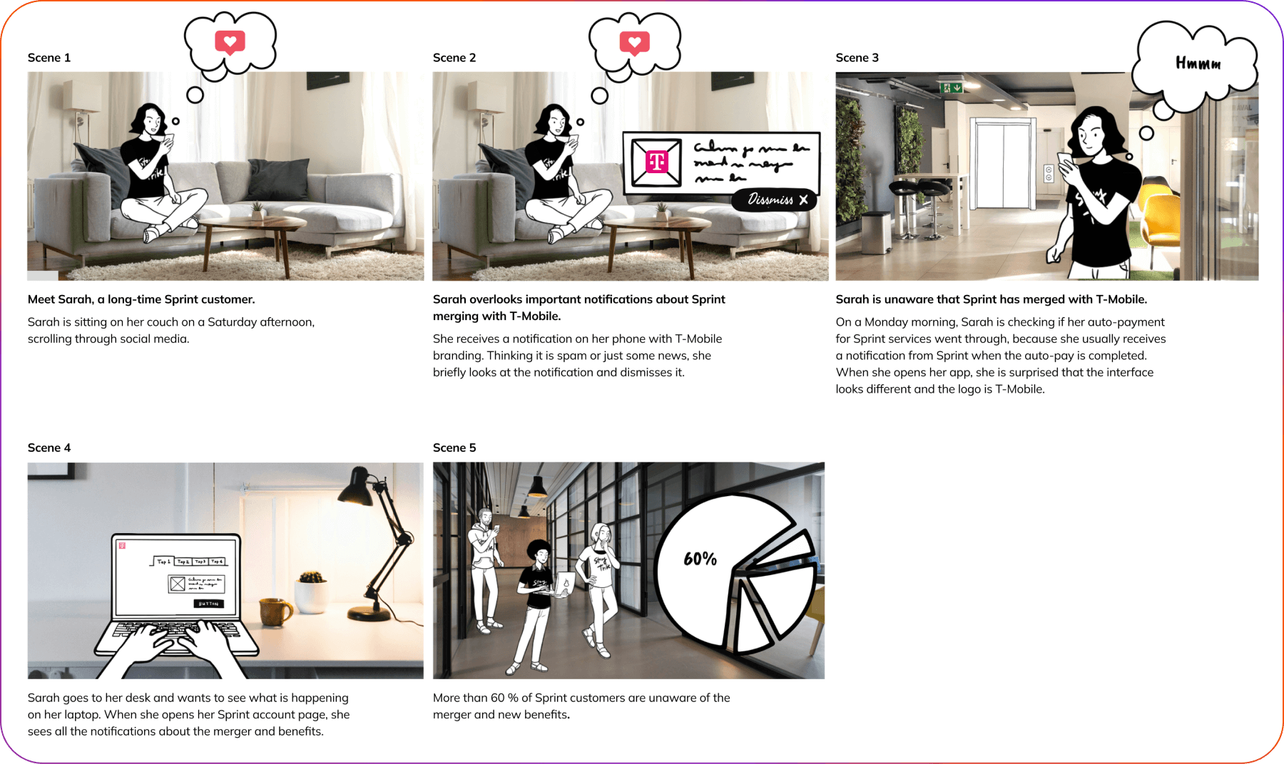
After some time, we realized that we have not been effectively communicating with Sprint's customers, providing them with a coherent narrative about the progress of the merger that T-Mobile becoming their carrier, and why this change will significantly enhance their experience.
- 60% of Sprint customers were unaware that T-Mobile had acquired Sprint
- Sprint customers are not aware of the benefits they receive from being part of T-Mobile.
My role
The main goal of this project was to assist Sprint legacy customers who rely on brand cues by providing better visual guidance to facilitate their migration path.
This involved developing a new Sprint migration design language framework and providing guidance to feature designers to develop the experience using the new visual language.
Approach
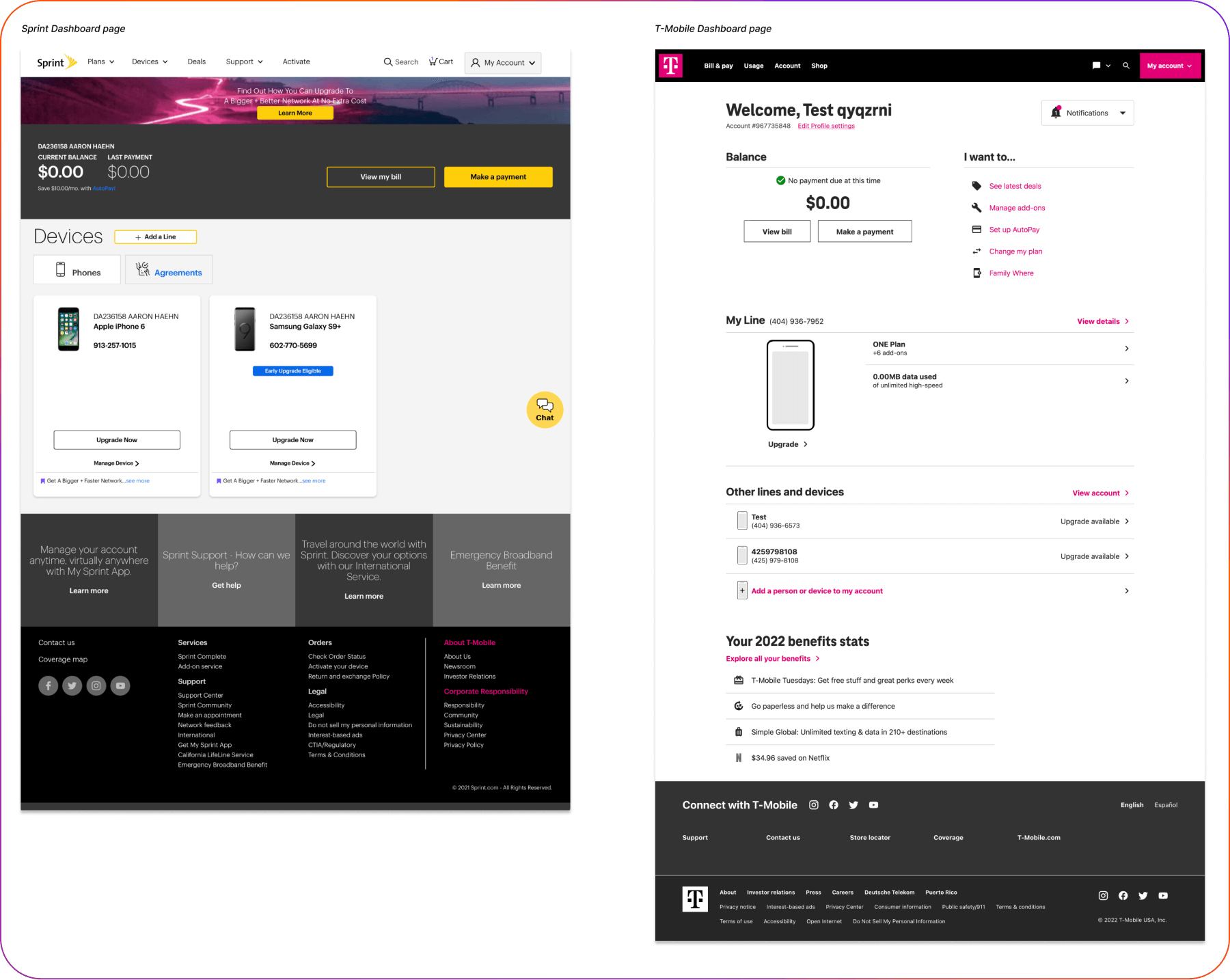
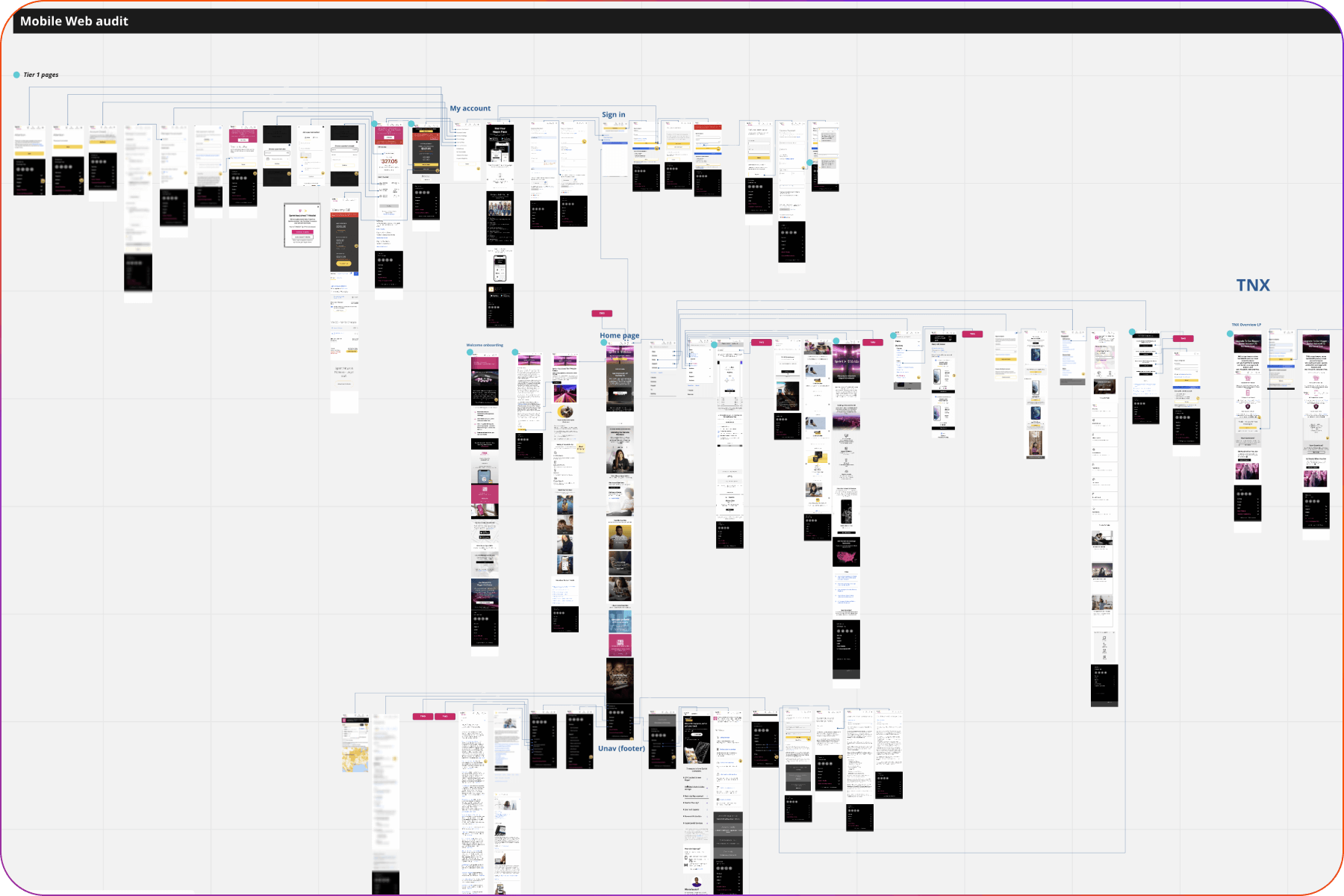
Since we were not familiar with the Sprint brand, I started by conducting a website and app audit.
This audit helped me understand the key elements that represent the Sprint brand, including the dominant use of the brand's yellow color, specific typography elements, iconography, and imagery.
Additionally, the audit provided insights into how Sprint developed the app experience, closely aligning with platform-specific components, which differed somewhat from our approach at T-Mobile. These insights guided me in determining what aspects to preserve in our new visual language.
Additionally, the audit provided insights into how Sprint developed the app experience, closely aligning with platform-specific components, which differed somewhat from our approach at T-Mobile. These insights guided me in determining what aspects to preserve in our new visual language.
The next step was to assess which elements of the Sprint brand to retain and which ones to replace with T-Mobile brand elements.
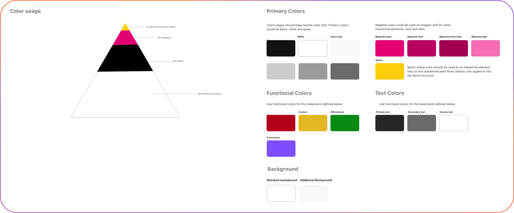
Given that Sprint's brand colors and T-Mobile's brand colors are contrasting, we decided to create a separate color palette specifically for the Sprint migration pages.
This palette was made more neutral, integrating a small amount of T-Mobile's magenta color. This approach was aimed at avoiding surprising users with a radical color change.
This palette was made more neutral, integrating a small amount of T-Mobile's magenta color. This approach was aimed at avoiding surprising users with a radical color change.
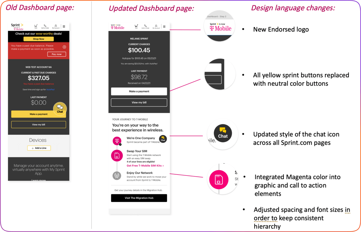
Logo
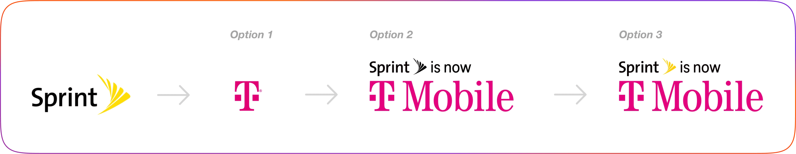
We created different logo variations and conducted testing with migration customers to gather feedback on their preferences.
Option 1: T-Mobile logo. However, customers were confused about why there was a T-Mobile logo on the Sprint site, even with banner information conveying this detail.
Note: 60% of Sprint customers didn’t know that T-Mobile bought Sprint.
Option 2: "Sprint is now T-Mobile" with a combination of neutral colors and magenta. Research revealed that the dominant magenta color made the Sprint logo text less visible to customers.
Option 3: "Sprint is now T-Mobile" with a yellow fan. This option achieved a balance between the two brands and reduced customer confusion.
Imagery
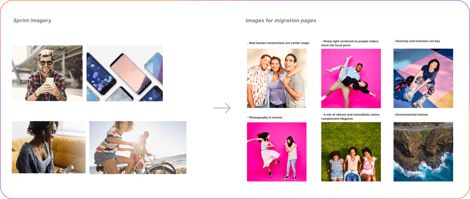
T-Mobile and Sprint imagery shared common brand characteristics centered around human connection. As a decision, we decided to replace all Sprint imagery with T-Mobile images. This change also enabled the integration of other T-Mobile brand elements, including color.
Challenges
Why we couldn't make certain changes.
Before finalizing the migration brand decisions, we needed to consider not only the brand elements but also the level of effort required by the developer teams to implement those changes. One example where we had to compromise on our brand decision was with typography. Changing the typefaces would have been challenging for the developer teams because, at the time, typography elements were hardcoded and the design token system was not yet in use.
Building guidance
When the main brand decision was made, reviewed, and approved by the leadership, the next task was to create an extensive suite of patterns and components, accounting for all states and scenarios - creating a comprehensive UI kit for our team to use.
The process was divided into two phases:
- Developers referenced the UI kit to update existing website pages, focusing on updating foundation-level elements.
- Designers reference UI kit in order to build new migration pages. For this phrase, I needed to build reusable components, such as form fields, modals, banners, etc.
Results
The main foundational elements were updated, and new pages were built based on the new visual guidance, resulting in improved customer satisfaction and reduced confusion around the Sprint migration process